Eclectric's artwork
Eclectric's artwork
I'll be posting my artwork here^^ I need to keep my skills sharp and I've been idle with my drawing for too long. I took a college drawing class and I don't want to forget everything I've learnedx3 Here's a sample for you. This was drawn in hatching style with pen and ink.
You do not have the required permissions to view the files attached to this post.


"The press can hold its magnifying glass up to our problems, bringing them into focus; or they can use that magnifying glass to light ants on fire, and then perhaps host a week of shows on the sudden flaming ants epidemic."

Re: Eclectric's artwork
hey, I own those same book ends! nice job
"BOW BEFORE THE SHAUNINESS THAT IS SHAUNI! "--Shadowman
"Shauni fell down a drainage ditch and died. That was the end of her pokemon journey. "--Shauni
Go to ROM the Comic


"Shauni fell down a drainage ditch and died. That was the end of her pokemon journey. "--Shauni
Go to ROM the Comic
Re: Eclectric's artwork
Thank you:D After doing this I thought I'd do pen hatches more often^~^
"The press can hold its magnifying glass up to our problems, bringing them into focus; or they can use that magnifying glass to light ants on fire, and then perhaps host a week of shows on the sudden flaming ants epidemic."

Re: Eclectric's artwork
That's actually one of my more-preferred art styles. Pen + hatches, that is. xD
That's fairly well done. I have no idea what the book ends are supposed to look like, but it looks decent. I guess you only drew one line instead of sketching (which is what I do; I sketch a lot), which makes it look a lot cleaner, but with one downside: the lines end up less than spectacular.
It's really well done for pen though. I know how hard it can be to get things right with pen... sometimes I wonder why I'm too lazy to pick up a pencil. xD


Re: Eclectric's artwork
Not bad. You did a pretty decent job with the shading in particular, though I'd recommend using a ruler, piece of paper, or some other guide when drawing long straight lines (such as those making up the base and back of the bookend) to make sure they stay straight.

-
Metalheadz
- Pokémon Master
- Posts: 6799
- Joined: Sat May 30, 2009 10:11 am
- Location: In your closet
Re: Eclectric's artwork
You did an AMAZING job with the dragon head. 
But I think the background can be improved a bit with some better lines.
But I think the background can be improved a bit with some better lines.
1 John 3:1 See what kind of love the Father has given to us, that we should be called children of God; and so we are. The reason why the world does not know us is that it did not know him.
Trophy Case:


Trophy Case:
Re: Eclectric's artwork
I did some light framework with pencil first. And yeah, the think about pen is you can't redo anything, you have to incorporate it into your drawingx3Flora wrote:That's actually one of my more-preferred art styles. Pen + hatches, that is. xD
That's fairly well done. I have no idea what the book ends are supposed to look like, but it looks decent. I guess you only drew one line instead of sketching (which is what I do; I sketch a lot), which makes it look a lot cleaner, but with one downside: the lines end up less than spectacular.
It's really well done for pen though. I know how hard it can be to get things right with pen... sometimes I wonder why I'm too lazy to pick up a pencil. xD
I agree with ya about the ruler thing. In hindsight I'm not sure why I didn't use one.Josiah wrote:Not bad. You did a pretty decent job with the shading in particular, though I'd recommend using a ruler, piece of paper, or some other guide when drawing long straight lines (such as those making up the base and back of the bookend) to make sure they stay straight.
Thank you^^ The background isn't really much, just there to give a better sense of the dragon being somewhere in space. I could have made all the lines straight and parallel but I didn't want it to look mechanical, you see.White_Samurai wrote:You did an AMAZING job with the dragon head.
But I think the background can be improved a bit with some better lines.
"The press can hold its magnifying glass up to our problems, bringing them into focus; or they can use that magnifying glass to light ants on fire, and then perhaps host a week of shows on the sudden flaming ants epidemic."
Re: Eclectric's artwork
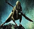
Here's one I did using Brice 5.5. This is my first time testing this out, tell me what you think^^
EDIT
Here's another thing I made using Brice^^
EDIT
Here's another thing I made using Brice^^
You do not have the required permissions to view the files attached to this post.
"The press can hold its magnifying glass up to our problems, bringing them into focus; or they can use that magnifying glass to light ants on fire, and then perhaps host a week of shows on the sudden flaming ants epidemic."
-
*^_^*kako

- Random Trainer
- Posts: 1259
- Joined: Fri Nov 21, 2008 2:54 am
- Location: http://kakohouseofanime.forumotion.net/
Re: Eclectric's artwork


Like any of the art you have seen here http://phpbb3.pebbleversion.com/viewtop ... =12&t=3098 and want to see more drop by one of these places! Make sure to leave a like if you,well like what you see. Have a great day!
Facebook: https://www.facebook.com/ArtOfHeartStudio Twitter: https://twitter.com/ArtOfHeartStudi
DeviantART: http://kako-cakes.deviantart.com/ Official Website: http://www.artofheartstudio.wix.com/art ... lifeareone
Re: Eclectric's artwork
This is the first one I've done in colored pencil in a while^^ I haven't put in a background yet, though, and it didn't scan very well. ><
"A Knight of Canadalot"
"A Knight of Canadalot"
You do not have the required permissions to view the files attached to this post.
"The press can hold its magnifying glass up to our problems, bringing them into focus; or they can use that magnifying glass to light ants on fire, and then perhaps host a week of shows on the sudden flaming ants epidemic."
-
*^_^*kako
- Random Trainer
- Posts: 1259
- Joined: Fri Nov 21, 2008 2:54 am
- Location: http://kakohouseofanime.forumotion.net/
Re: Eclectric's artwork
Like any of the art you have seen here http://phpbb3.pebbleversion.com/viewtop ... =12&t=3098 and want to see more drop by one of these places! Make sure to leave a like if you,well like what you see. Have a great day!
Facebook: https://www.facebook.com/ArtOfHeartStudio Twitter: https://twitter.com/ArtOfHeartStudi
DeviantART: http://kako-cakes.deviantart.com/ Official Website: http://www.artofheartstudio.wix.com/art ... lifeareone
-
Metalheadz
- Pokémon Master
- Posts: 6799
- Joined: Sat May 30, 2009 10:11 am
- Location: In your closet
Re: Eclectric's artwork
Wow, you put lots of detail into that. :D
1 John 3:1 See what kind of love the Father has given to us, that we should be called children of God; and so we are. The reason why the world does not know us is that it did not know him.
Trophy Case:
Trophy Case:
-
BionicleMandi121
- Random Trainer
- Posts: 2227
- Joined: Fri Dec 31, 2004 8:30 pm
- Location: Depends. :K
Re: Eclectric's artwork
Hm, the shading is nice. You got the folds in the cloth and everything. However, on other portions (mostly the right shoulder pad, upper arm brace, and...lance? Dunno what to call it), I think a little more contrast would be nice.
Additionally, there's a few anatomy problems. His limbs are too short, and the closer forearm looks too thin. The hands should also be bigger; the way you've got them, I'm estimating them to be about the size of face from chin to the top of the nose. Hands as a general rule should be long enough to cover the face at least from chin to forehead.
Additionally, there's a few anatomy problems. His limbs are too short, and the closer forearm looks too thin. The hands should also be bigger; the way you've got them, I'm estimating them to be about the size of face from chin to the top of the nose. Hands as a general rule should be long enough to cover the face at least from chin to forehead.


Should I...oh whatever. /o/

Meh Siggy Site
And another one because they decreased the number of allotted pages on free sites
Re: Eclectric's artwork
I noticed that proportion problem. I'm not really used to human body proportions, ya know, so that advice about hand size and arm thickness is very helpful^^ As for the value on the right shoulder and other places, there is more value there but the scanner didn't pick it up. It missed a whole shadow on the Canada leaf on the horse's neck, too><
"The press can hold its magnifying glass up to our problems, bringing them into focus; or they can use that magnifying glass to light ants on fire, and then perhaps host a week of shows on the sudden flaming ants epidemic."
-
Neo Zanther
- Pokémon Champion
- Posts: 8127
- Joined: Mon Sep 20, 2004 11:40 am
- Location: Deep in the Dark forest of D-Edge
Re: Eclectric's artwork
Well I do have to say you got some good art going on here. Keep it up. Practice makes you better :)